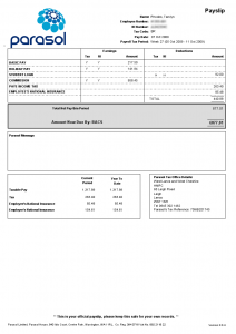
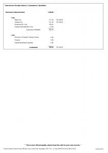
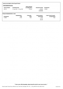
You know there's something seriously wrong when your payslip is three pages long and comes with a two page explanatory leaflet. Payslips are often pretty cryptic but the one I received today was so bad it took me over half an hour to work it out. All I really care about is how much have I earned, how much am I getting and, most importantly, where did the rest go?
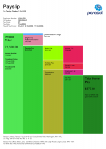
The only way I could decipher this mess was to draw a kind of bar chart and fill in the numbers. Once I finished I realised that I had inadvertently created a hugely more readable representation of the information contained in the payslip. So here's a copy of the original payslip and my effort at an improved version.
Click each image to expand and do spend a few minutes trying to make sense of them.
This improved version displays the same information condensed into one page while clearly showing the relationship between the figures.
Now bear in mind that I'm not an accountant, nor am I an information designer. I'm not even a graphic designer. But I am someone who receives payslips and wants to understand them. And from that point of view I hope you'll agree it's a vast improvement.
The principles of usability apply to more than websites & software. Just about everything can benefit form a bit of sensible design.


